1. Introduction
Overview
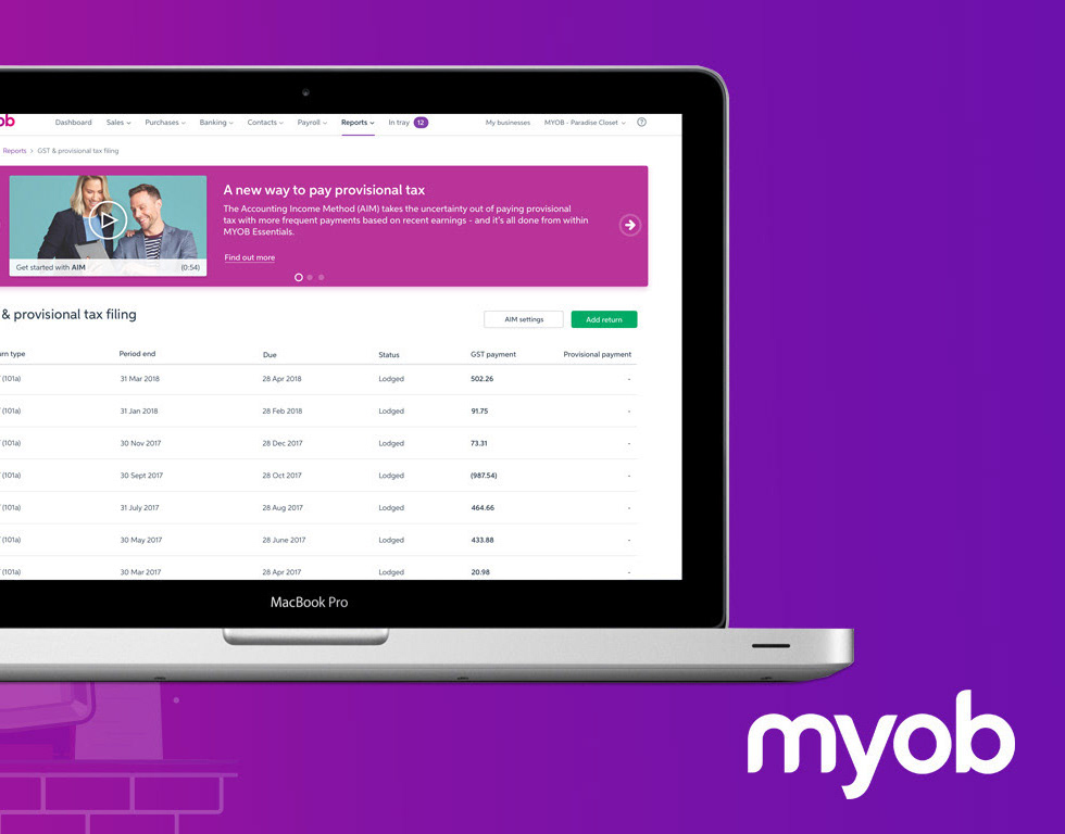
MYOB Practice is a clouded accounting product that allows practices to lodge their tax forms and manage their clients’ base online.
This product plays a big part in the MYOB ‘connected practice’ strategy. This strategy aims at freeing the time of accountants and bookkeepers by automating most, if not all, of their time-consuming daily tasks, such as data entry and client queries.
The ultimate objective is to allow accountants to focus on advisory work and to allocate their time to delivering real-time insights on goal planning and the financial health of businesses, and less on manual tasks.
This component allows, on scroll, to reduce the header of a section and or it's navigation, optimising the content real estate of the page and allowing the users to be able to focus on their current task.

Problem statement:
The problem we are solving here is the one of real estate.
The different levels of navigation and the multitude of call to actions in within the compliance section of MYOB Practice result in a loss of up to 50% of the workable space or real estate allocated to work itself (workpapers, schedules, or forms ...).
As users scroll down the page, they loose all informations about the job and the workflow navigation.
As users scroll down the page, they loose all informations about the job and the workflow navigation.
Only the main navigation (document , task ....) remains sticky as user are scrolling which is of little value when working on the job.
User & audience:
Admin
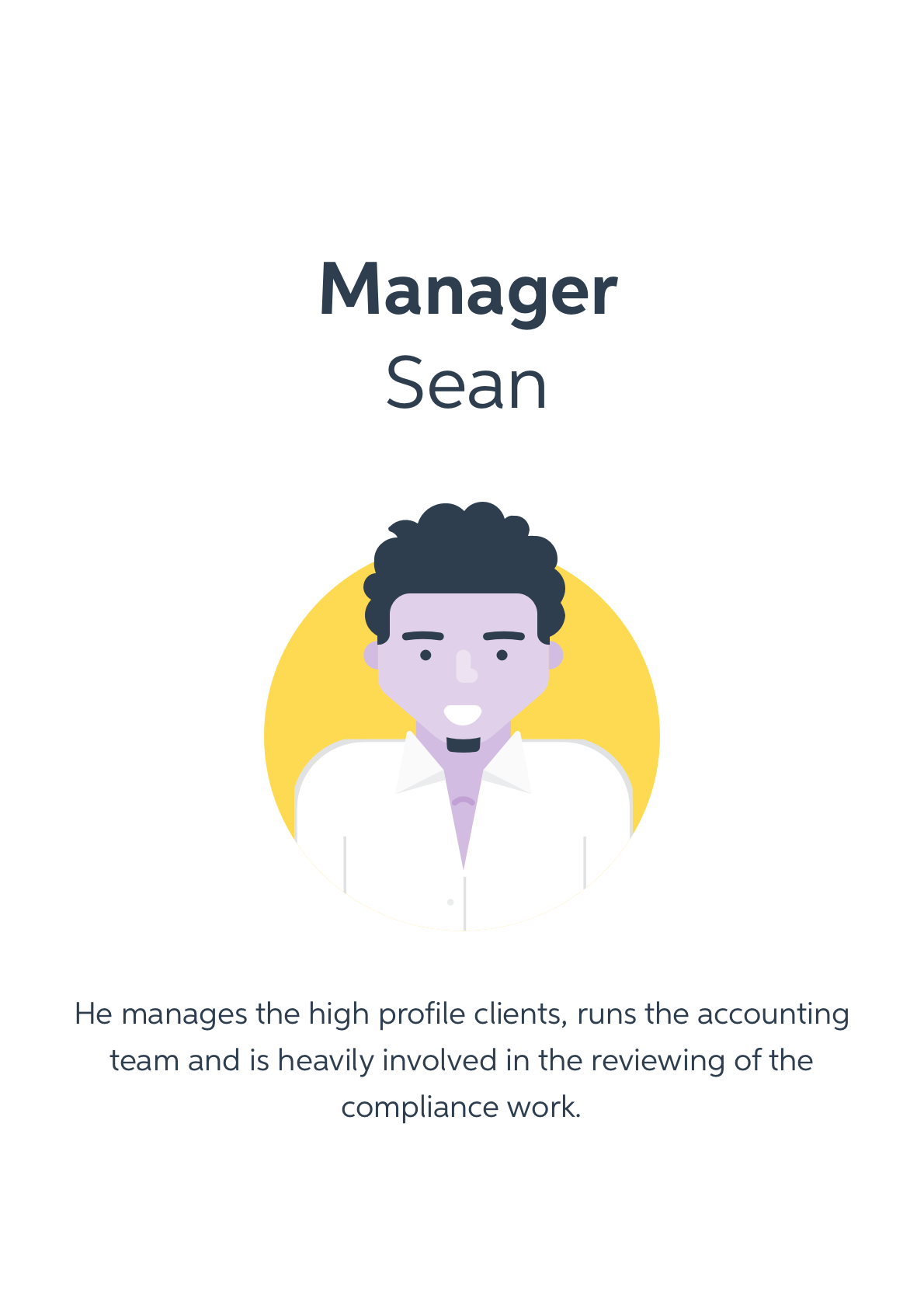
Manager
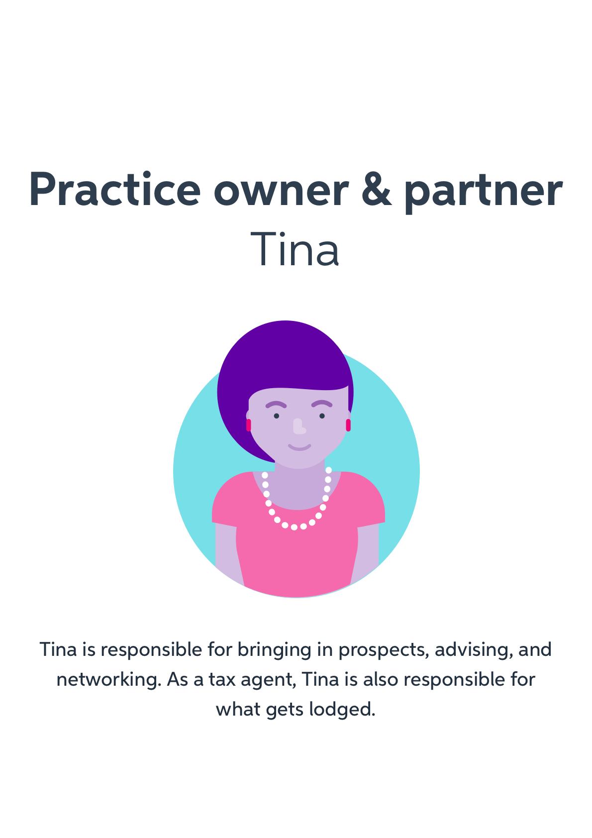
Practice owner
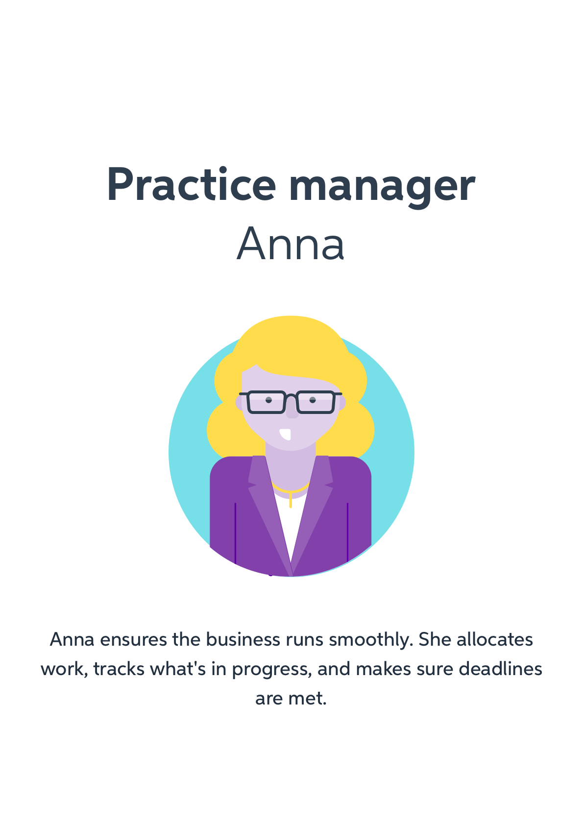
Practice manager
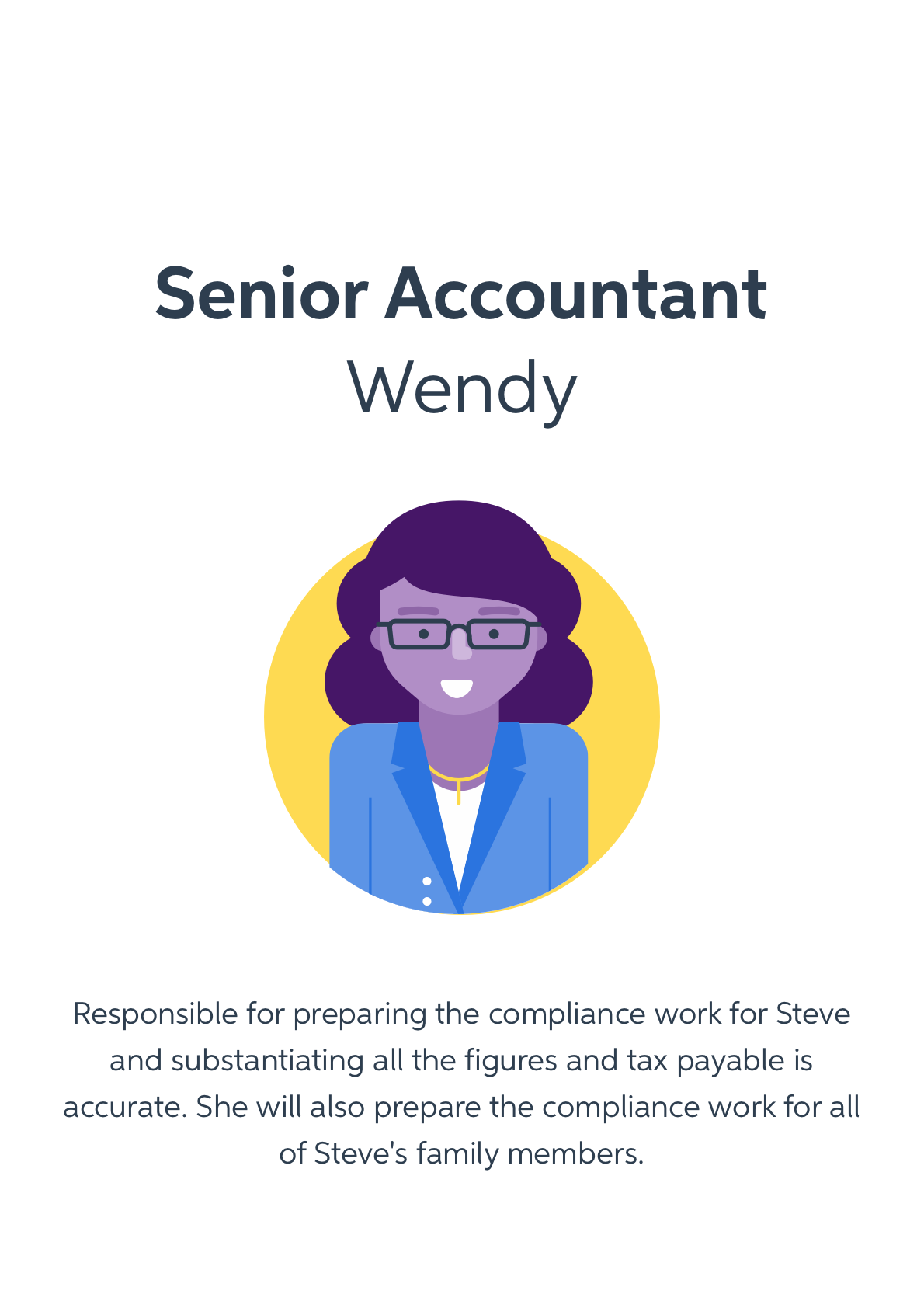
Senior accoutant
Roles and responsibilities:
The team:
PM - Lisa Miks
BA - Mena Sedrak
Senior Product Designer - Paul Rodens
Visual designer - Michael Wu
Development crew - Spectrum
My Role:
I led the design and the interaction of this experience between July 2019 and August 2019 in collaboration with the development crew and a visual designer.
This behaviour has been implemented in product.
Scope and constrains:
High-level requirements:
• Implementing a scrolling behaviour, that would keep some elements of the navigation sticky but also reduce the amount of information available to the user, so they can focus on the task they are working on
Constrains:
• The way MYOB Practice is structured as a product, and the intention of this pattern would mean that several modules would be impacted
• User testing such a behaviour was a bit of a challenge as invision prototypes makes it hard to replicate such behaviour


2. What happened
the Design Process


2.1 Discover Insights to the problem
We got some user insights and direct feedback, complaining about the available space for accountant to do the work.
Users felt the navigation is taking too much space and the space allocated to the forms they want to work on too small.
Users felt the navigation is taking too much space and the space allocated to the forms they want to work on too small.
What did we know?
• Some previous user testing had led us to design the header of that section in that way, making all modules of the compliance workflow available to them at all time.
Our hypothesis
• Users want to have more real estate to work on.
• Users want to be able to navigate across the compliance workflows
• Users want to retain access to all the relevant call to actions necessary to them when working on a job
• Users care less about the main navigation but more about the workflow they are currently in
• Users want to be able to navigate across the compliance workflows
• Users want to retain access to all the relevant call to actions necessary to them when working on a job
• Users care less about the main navigation but more about the workflow they are currently in

2.2 Define - the are to focus on
What we didn’t know and wanted to discover
• How do users navigate the page and what elements of the navigation are they expecting to see at all time
• How do users would retrieve the main navigation after it has scrolled off the page
• How do users would retrieve the main navigation after it has scrolled off the page

2.3 Develop - potential solution
To improve on the user problem, we agreed, with PM and BA, to add a task related to the header behaviour to a running usability tests.
The timeframes also didn’t really allow us to run any discovery interviews, so we had to jump into usability test relatively quickly with a first cut of the solution.
What was tested?
• Observed user's reaction to the scrolling behaviour
Usability testing
• Semi interactive prototypes (done in Sketch and Invision) that allowed testers to perform specific tasks
• High fidelity prototypes (we don’t really do many low fidelity prototypes at MYOB once we go to user testing)
What was the result? Highlights?
Tasks: scrolling down the page and observe the header
Highlights:
• All 6 testers like the fact that you get more real estate in order to work on the form
• 1 tester thinks we could even be even more radical with our concept
• 5 testers understand you can retrieve the full navigation by scrolling back up
• 3 testers are happy for the main navigation to disappear while 1 user wants it there at all time
• 2 testers are making the analogy with Excell and frozen rows and columns
• 5 testers want to be able to continue navigation the workflow while being in the CTR (confirmation)
• 3 testers do mention the fact that they loose context of the client they are working on

2.4 Deliver -Solutions that work
What did I deliver?
What did I deliver?
The findings of the round of user testing was presented to the key stakeholders and we decided to move forward with the behaviour.
Based on these insights, we agreed on the first version of the header behaviour and what needed to be released in order to improve the issue reported by the users.
This was a combined effort with the development team, BA and PM.
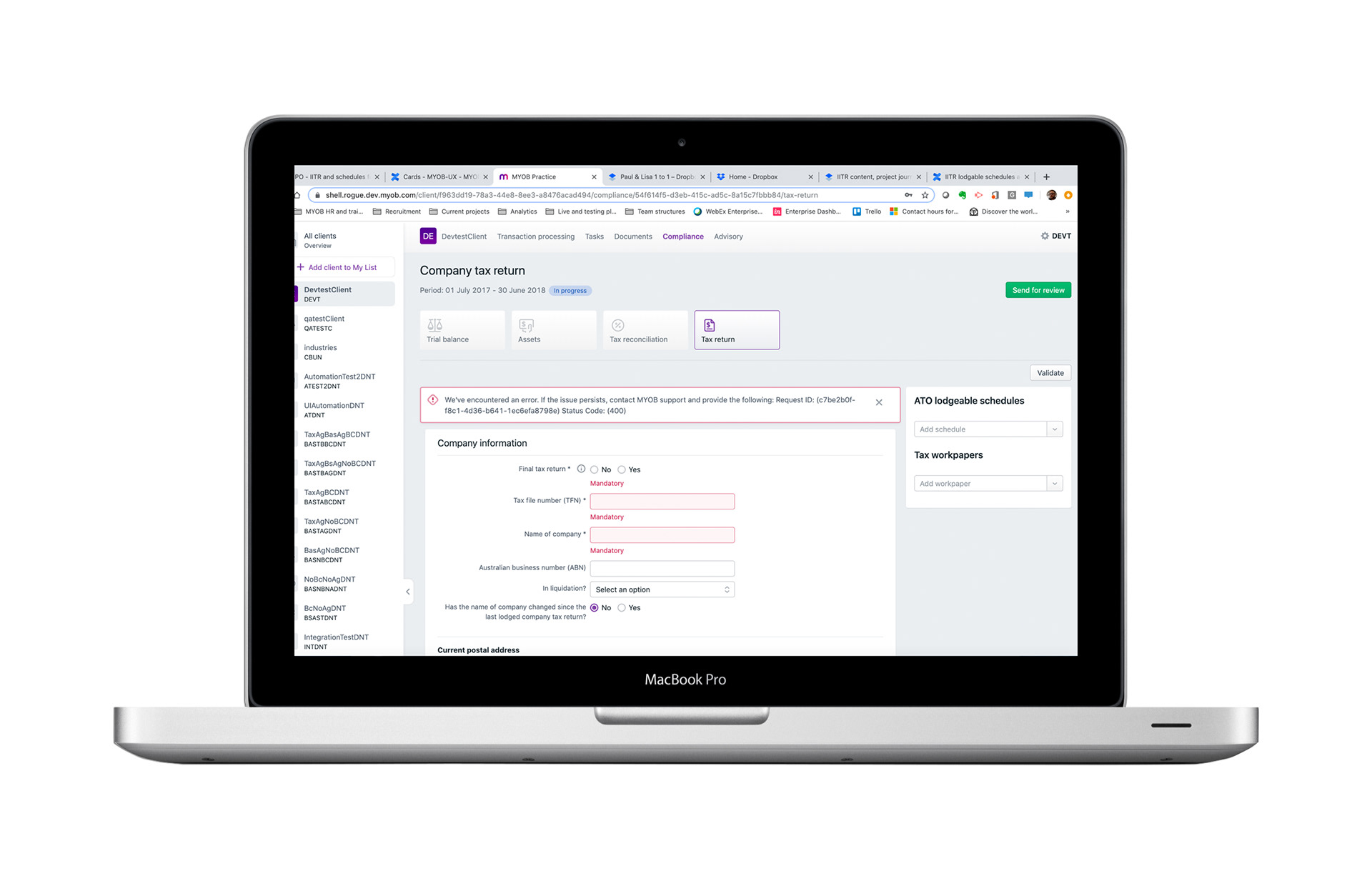
Anatomy - what makes up this component?Based on these insights, we agreed on the first version of the header behaviour and what needed to be released in order to improve the issue reported by the users.
This was a combined effort with the development team, BA and PM.
• The top navigation (includes the key related sections to the client, including the selected client if we have one selected)
• The breadcrumb
• The page tittle or H1
• The period covered by the specific compliance form
• The status of this job (in progress ... )
• Job level call to actions or buttons that will allow users to navigate and move the job for one status to another all the way to the lodgement
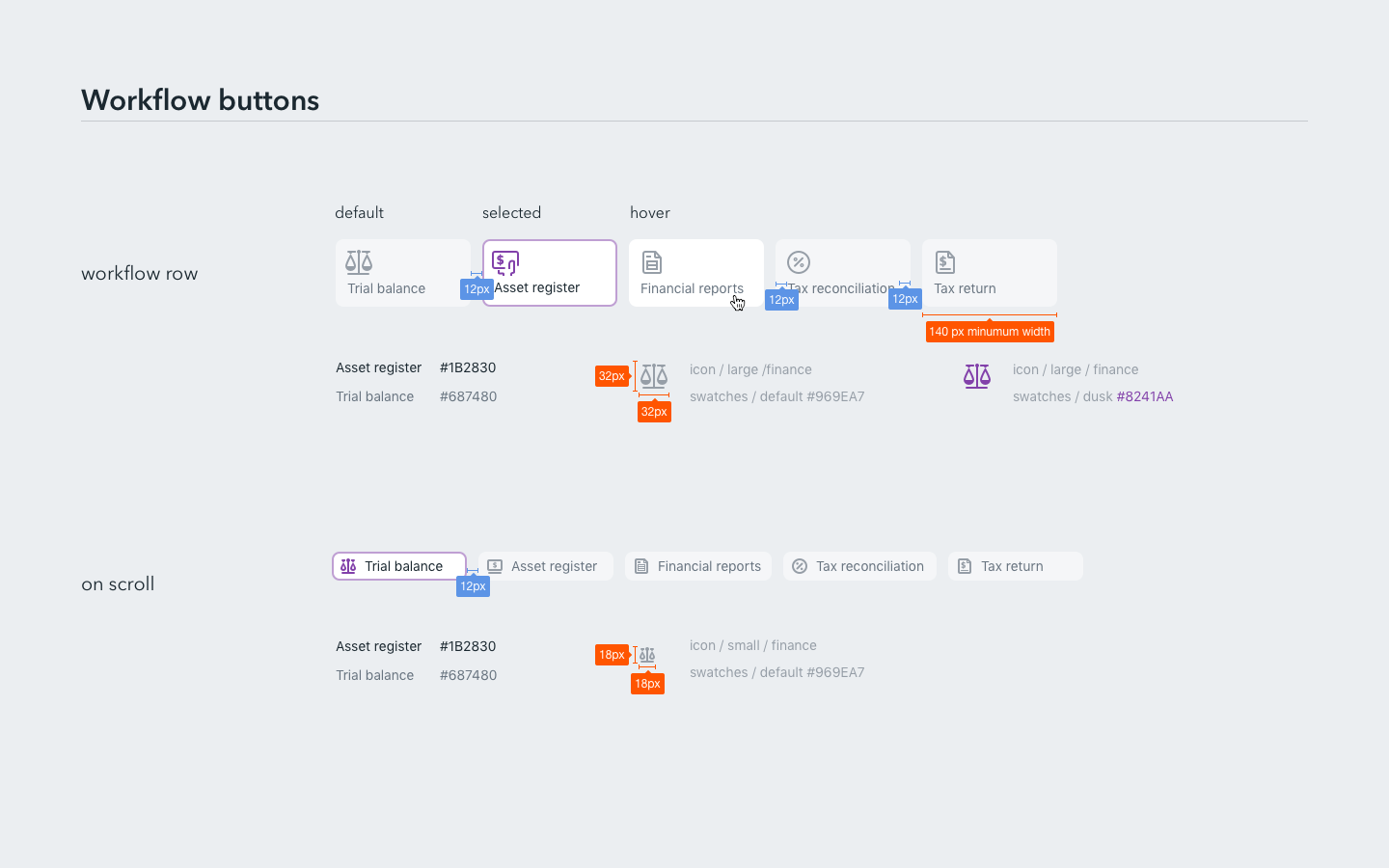
• The workflow navigation or tiles navigation, that allows users to navigate between the different component of a specific job (TB, Assets registry, the form itself)
Note that the number of tiles may vary depending on the type of job (ex: BAS only has one tile)
Page level call to action or buttons. Some actions are only specific to the section your are currently in
• The breadcrumb
• The page tittle or H1
• The period covered by the specific compliance form
• The status of this job (in progress ... )
• Job level call to actions or buttons that will allow users to navigate and move the job for one status to another all the way to the lodgement
• The workflow navigation or tiles navigation, that allows users to navigate between the different component of a specific job (TB, Assets registry, the form itself)
Note that the number of tiles may vary depending on the type of job (ex: BAS only has one tile)
Page level call to action or buttons. Some actions are only specific to the section your are currently in
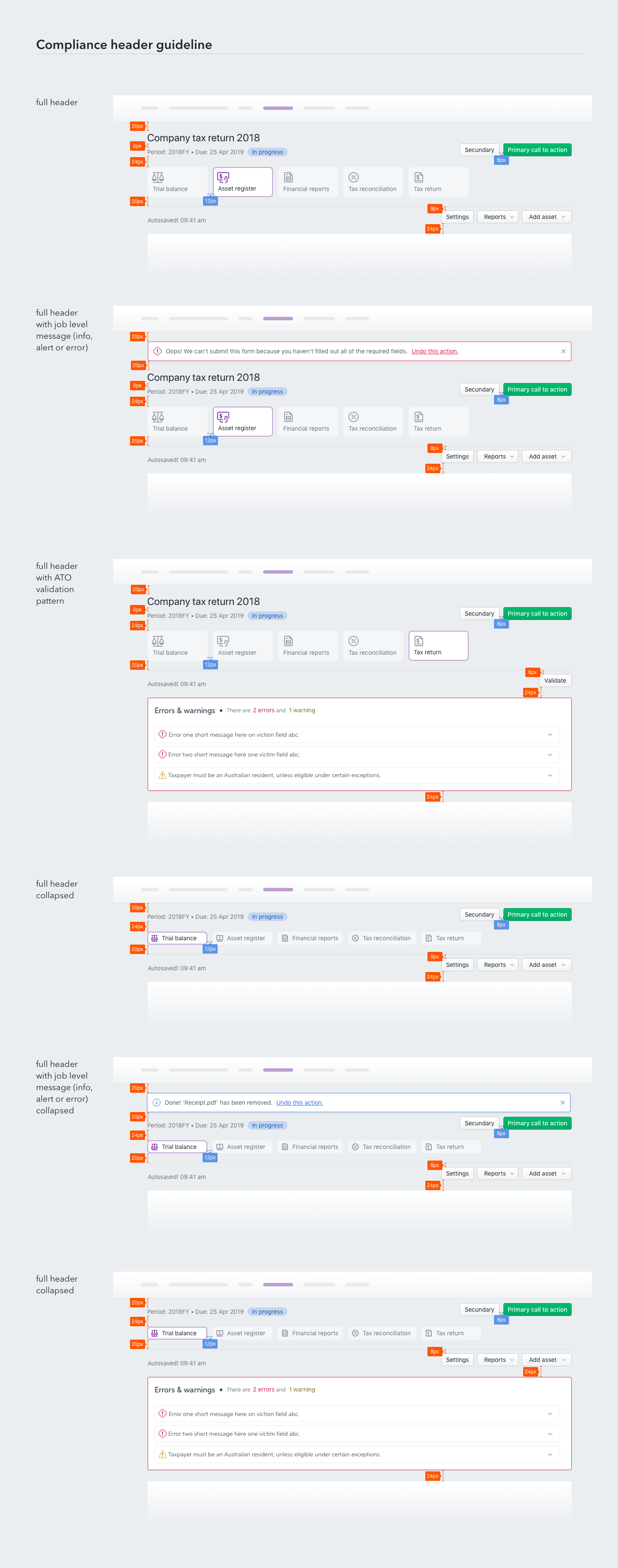
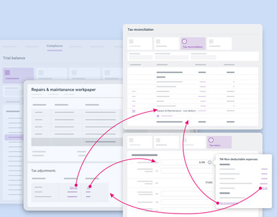
Anatomy and behaviour
Behaviour- how does the component behave according to user interactions?
• Step 1: as the user first land on the page, it does display the full content of the header
• Step 2: as the user scrolls the page, the headers "condensed itself into a condensed version:
This state of the header remains sticky as the user scrolls down the page
• Step 3: if the user want to retrieve the full (or expanded navigation), this will happens when the user scrolls back up the page (Scroll back up twice)
• Step 4: the main navigation can also be retrieved by pointing the mouse cursor at the top of the browser page
• Link to the prototype
Some trade offs were made and we had to make some compromises that went against the users’ feedback that we uncovered during the user testings.
What were they?
• Despite users commenting on the main (or top) navigation not being necessary while they are in a workflow, this hasn't been implemented just yet. The reason being that it would be a unique behaviour for this section of MYOB practice only.
• Some of the call to actions scroll off the page, while some remain sticky. This is due to a technical limitation.
• Most of the error panels, alerts and messages do scroll off as well.


3. In conclusion
Outcomes and results:
• Despite running 2 technical spikes with principal developers, when the work started, the crew realised the complexity of the task. Not so much in therms of behaviour but due to the fact that the way that section is being built has a lot of different components and blocks that need to be manipulated in order to replicate this behaviour.
This wasn't really picked up before hand and resulted in the effort being greater than expected.
This wasn't really picked up before hand and resulted in the effort being greater than expected.
• This projects highlighted some usability issues with the header of the compliance section: Lack of hierarchy of messages and the multitude of buttons and call to actions available to the users.
• Actions: the design team is currently reviewing the header design in order to tackle the messages and call to action issue
• Actions: the design team is currently reviewing the header design in order to tackle the messages and call to action issue