1. Introduction
Overview
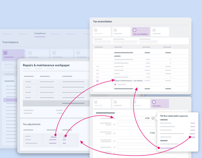
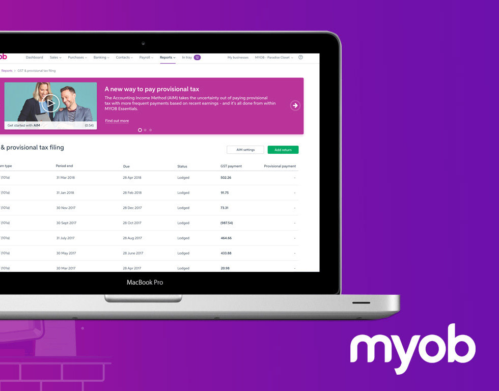
MYOB Practice is a clouded accounting product that allows practices to lodge their tax forms and manage their clients’ base online.
This product plays a big part in the MYOB ‘connected practice’ strategy. This strategy aims at freeing the time of accountants and bookkeepers by automating most, if not all, of their time-consuming daily tasks, such as data entry and client queries.
The ultimate objective is to allow accountants to focus on advisory work and to allocate their time to delivering real-time insights on goal planning and the financial health of businesses, and less on manual tasks.

Problem statement:
The design team discovered, across MYOB Practice (and SME products) various ways to indicate to the user that there is no content available, the page doesn't exists or that they need to action something specific (in AE, AO ...) in order to have access to that content: empty screen illustrations with our without messages or even an appropriate call yo action, banners, pop up ... There was a need to create a pattern that brings consistency but also helps the users to solve the situation they find themselves in.
The intention of this pattern is to unify our approach on how to communicate something has gone wrong (or has gone well!) and how to move forward and or solve the issue they are facing.
During a consistency audit of the product, I highlighted that we had several ways to communicate to the users that; the content is not available, that an action is needed from the user or simply that they have done all they needed to do.
User & audience:
Admin
Manager
Practice owner
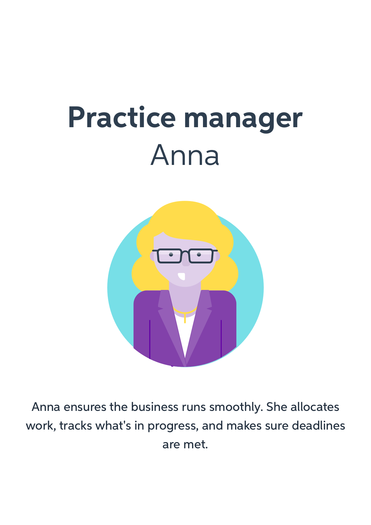
Practice manager
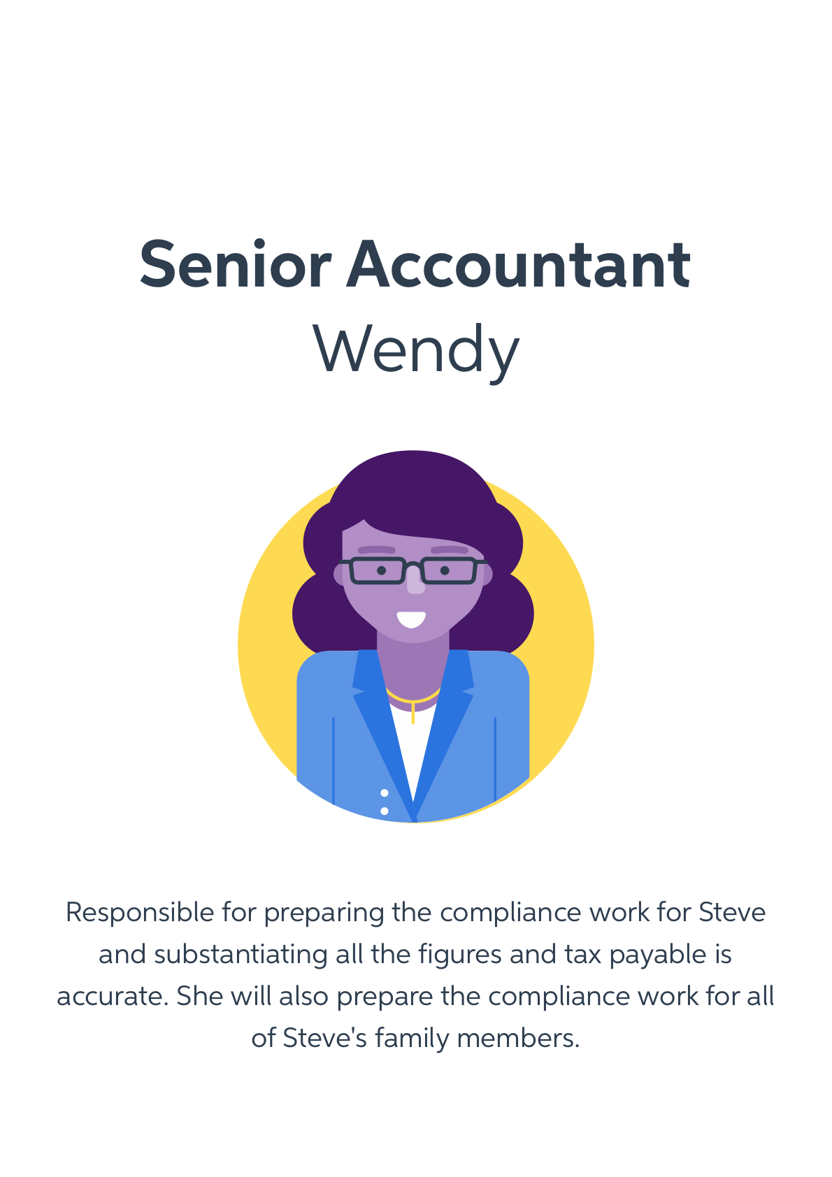
Senior accoutant
Roles and responsibilities:
The team:
Senior Product Designer - Paul Rodens
Principal visual designer - James Sanns
Front end designer / developer - Jonno Reikwel
Development crew - across the entire Accounting nation (multiple dev crews involved
Senior Product Designer - Paul Rodens
Principal visual designer - James Sanns
Front end designer / developer - Jonno Reikwel
Development crew - across the entire Accounting nation (multiple dev crews involved
My Role:
I led the design and the interaction of this experience between May 2019 and June 2019 in collaboration with the principal visual designer and the front end developer.
This pattern is now in product and will be soon available as part of MYOB's GEL (Feelix)

Feelix.com
Scope and constrains:
High-level requirements:
• Coming up with a “system” or a visual formula that can address all the use cases identified
• That way this feature can become a consumable pattern for all nations at MYOB using the design system (Felix)
• That way this feature can become a consumable pattern for all nations at MYOB using the design system (Felix)
Constrains:
• Being able to retrofit inconsistent and varied implementations across the product (MYOB practice)


2. What happened
the Design Process
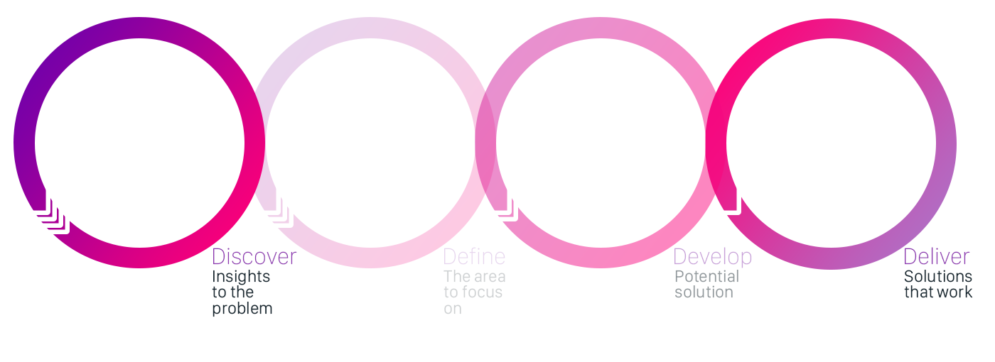

2.1 Discover Insights to the problem
This piece of work is more of an internal alignment and consistency effort.
There was no real "user feedback" reported as such but we realised, as a team, the lack of consistency across the platforms.
There was no real "user feedback" reported as such but we realised, as a team, the lack of consistency across the platforms.
What did we know?
• Environmental scan and recommendations when it come down to empty states.
Our hypothesis
• Users want to be informed of the reasons a page is down, an action couldn't be performed or why no results are showing.
• Users want to know the way forward and how to get out of that state
• Users want to know the way forward and how to get out of that state

2.2 Define - the are to focus on
The use cases this pattern will applicable to
• 404 pages (or any terminal errors that may results in the page not being found)
• No results (as a result of a search and or a combination of filters applied)
• Something has gone wrong (our systems are down preventing the user to progress in it's task)
• Access denied (the user doesn't have access or need to request permissions ...)
• Time out (the session has expired)
• No results (as a result of a search and or a combination of filters applied)
• Something has gone wrong (our systems are down preventing the user to progress in it's task)
• Access denied (the user doesn't have access or need to request permissions ...)
• Time out (the session has expired)

2.3 Develop- potential solution
UX recommendation (based on best practices)
Clearly explain that there are no matching results
• Make It Obvious That There Are No Results
• As any self-help book will tell you, the first step in recovery is admitting you have a problem.
• No Results pages must clearly state that no results have been found to match the user’s search terms.
• Appropriate typography and spacing are essential; otherwise, users can easily overlook or misunderstand the message.
Offer starting points for moving forward
• Most users understand the basics of how to search: first think of a word to describe what you want, next type it in the box, and then press the Search button.
• But the average person is not very good at more sophisticated search techniques like query refinement.
• When our users get no results for a query, they need all the help they can get to come up with alternative search strategies, such as:
- Restating the original query
- Providing a search box (with the original query still in it for easy editing)
- Suggestions for similar queries that do return results
- Spelling corrections
- Advice about how to modify queries, using different words or fewer word
Don't mock the user
• For some brands, humorous language and images make perfect sense and help engage the audience.
• But exercise extreme caution when trying to use humour on No Resultspages (or other error pages).
• Think about the context: users encounter these pages when they have just failed to find something.
• Humour can be a powerful way to defuse tension and express empathy, but it can also easily be misunderstood—especially online, where you can’t use intonation and body language to express nuances of tone.
• Your users may not be able to tell whether you are laughing with them, or laughing at them, and most people don’t enjoy being mocked, especially when they are already frustrated.
Source: Nielsen Norman Group
Consistent usage of illustrations
• The lack of clear guidance in the illustration use results in designers using a variety of illustrations to illustrate the same

2.4 Deliver -Solutions that work
What did I deliver?
What did I deliver?
We delivered a modular pattern that covers, in a flexible way, a variety of use cases.
This pattern is currently available as editable symbol in MYOB Sketch library and will see it's way in MYOB design system (Feelix)
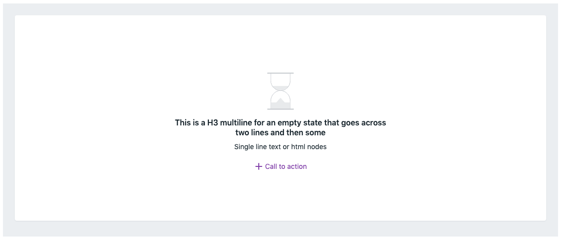
Anatomy - what makes up this component?
This pattern is currently available as editable symbol in MYOB Sketch library and will see it's way in MYOB design system (Feelix)
Anatomy - what makes up this component?
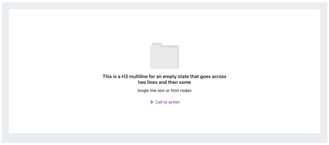
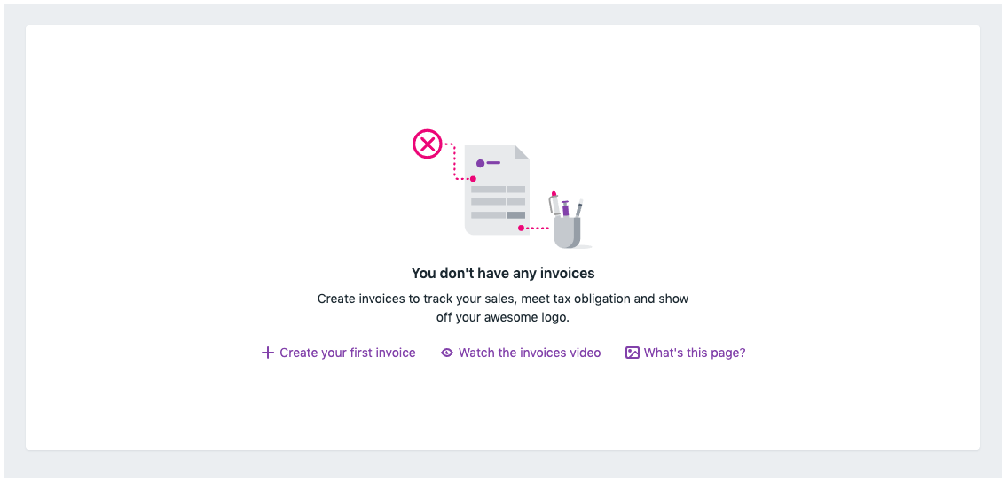
In its most common form, the empty state should consist of:
• An appropriate illustration that should (as much as possible) represent or reflect the situation the user is facing
• A description of what the problem or the issue is
• More description if needed
• A call to action with clear indication on how to get out or resolve the state the user is currently in or facing, this can be a link or a button
• A description of what the problem or the issue is
• More description if needed
• A call to action with clear indication on how to get out or resolve the state the user is currently in or facing, this can be a link or a button
Time out
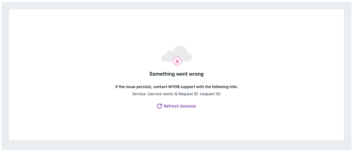
Something went wrong
No results found
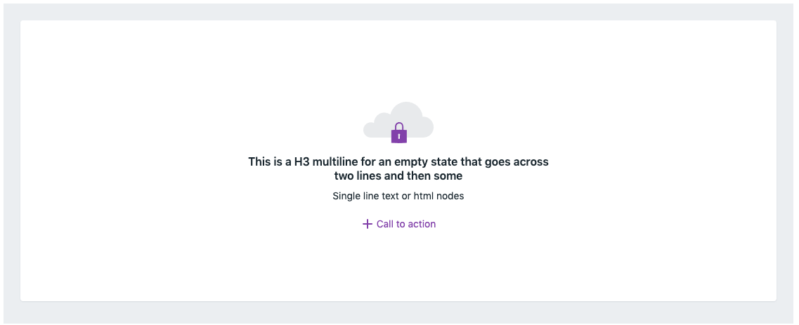
Access denied
Custom image


3. In conclusion
Outcomes and results:
• The delivery of this pattern was relatively easy and straight forward. As there are no dependency on backend, the implementation of the recommendation is relatively straight forward.
The pattern is designed to cover a variety of use cases and scenarios and can evolve over time.
The pattern is designed to cover a variety of use cases and scenarios and can evolve over time.