1. Introduction
Overview
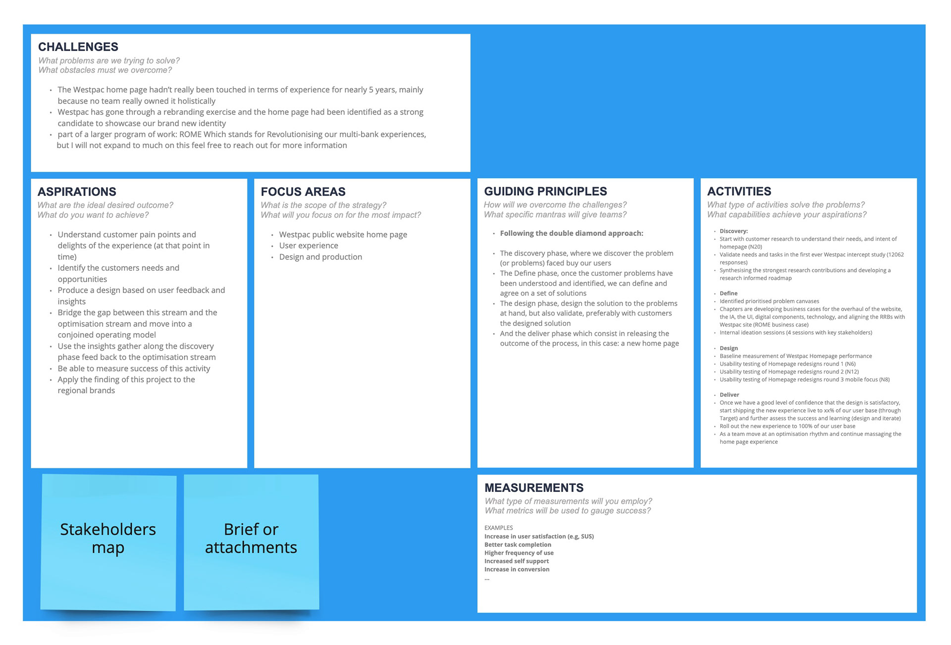
The Westpac home page hadn’t really been touched in terms of experience for nearly 6 years, mainly because no team really owned it holistically. Lots team were contributing to it, but none really owned the experience.
Westpac has gone through a rebranding exercise and the home page had been identified as a strong candidate to showcase the brand new identity.
Our approach
Background:
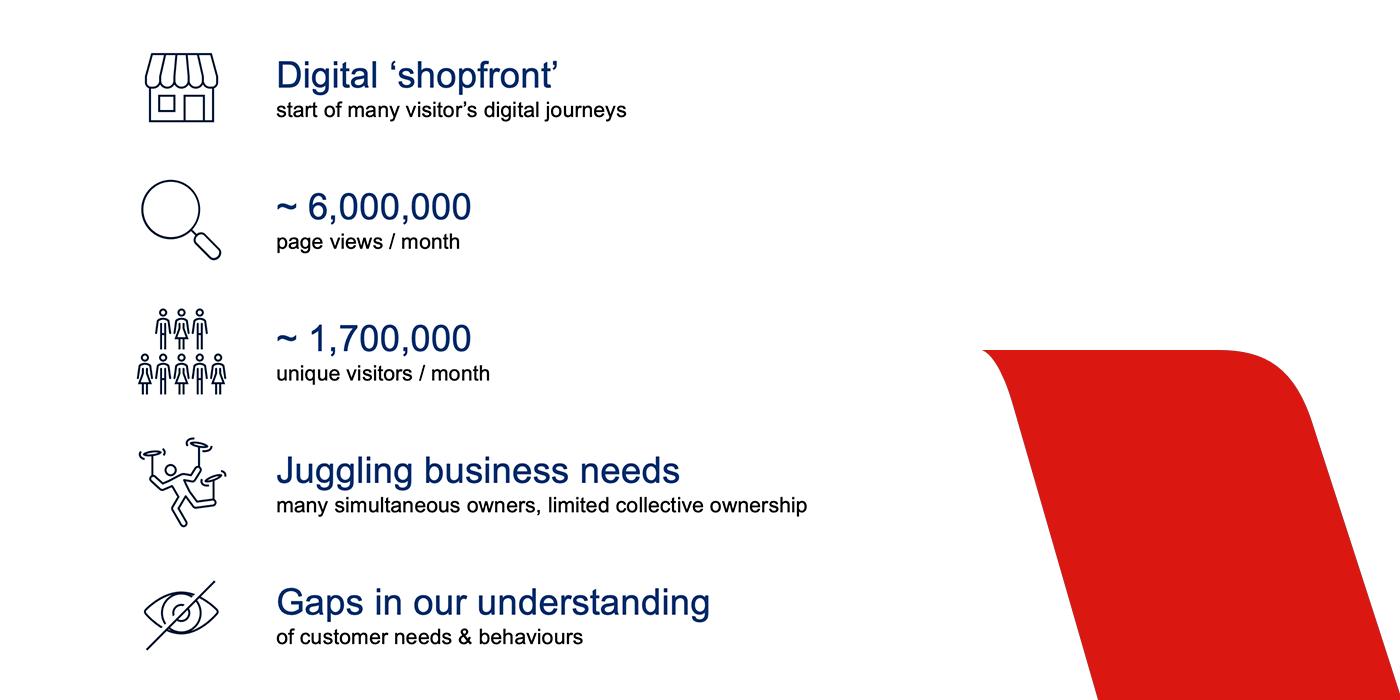
We chose tackle this opportunity because we recognised that our group homepages are the ‘shopfront’ to our digital experience for many visitors
And collectively they receive over 6M page views and 1.7M Unique visitors per month
And we knew that our homepages had the nuanced tasks to balance a variety of business objectives
But equally, we knew we had some gaps in understanding the needs of our homepages from the perspective of our customers
Objectives:
From a business perspective:
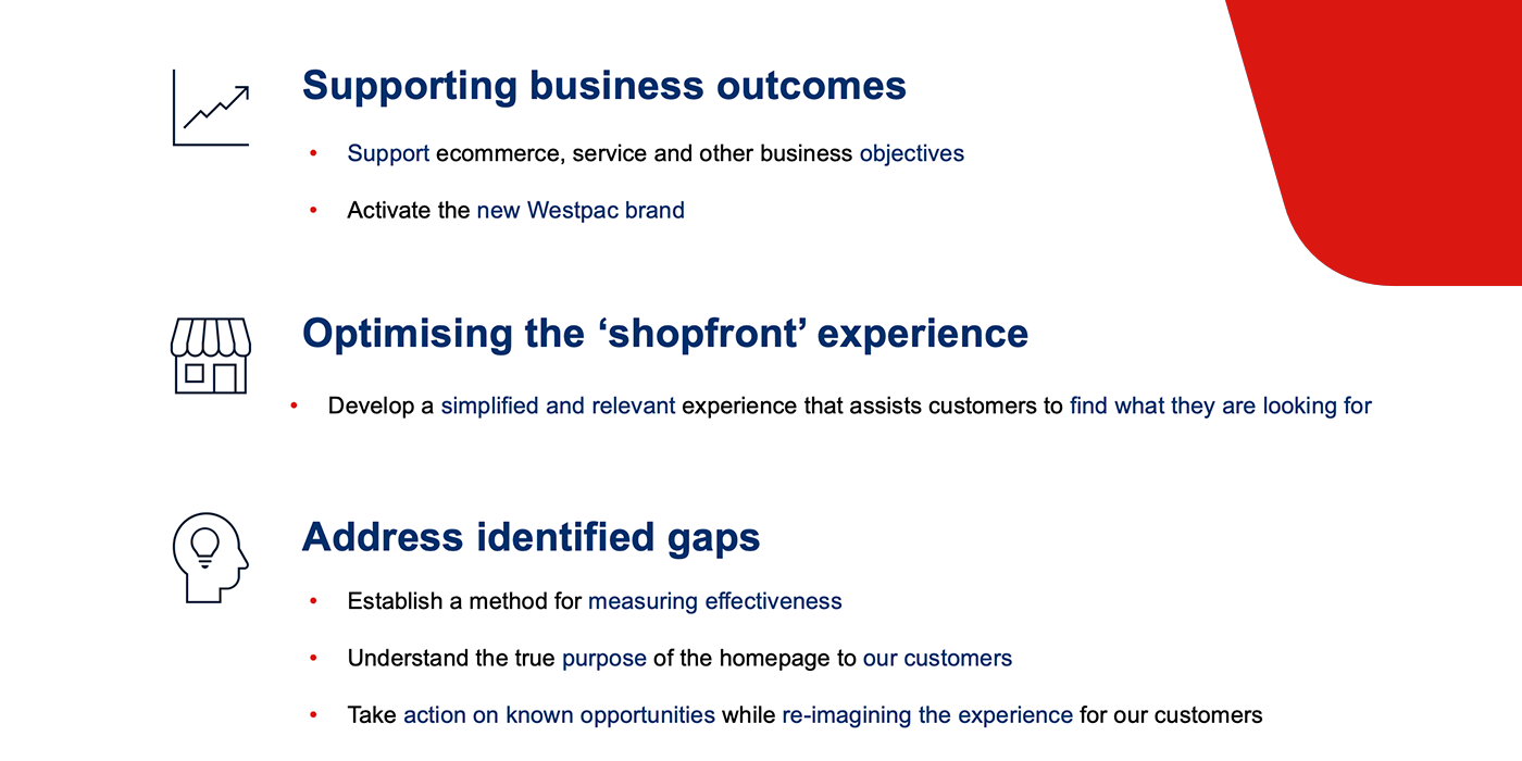
- Support ecommerce, self-service and other business and team objectives
- HP plays the critical first step in directing people to these journeys
- We would need to work with many teams on this call today to understand their objectives and ensure we deliver a seamless experience for our customers as they engage with our brand across our wider digital ecosystem
- (at the time) Activate and re-enforce the new Westpac brand
From an XD perspective
- Develop a simplified shopfront experience that would assist customers to easily find information they were looking for
and to address the gaps in our understanding
- Establish a method for measuring homepage effectiveness
- While we had a clearer understating the objectives of the homepage from our Business perspective, we had some work to do in understanding what the true intent and purpose of the homepage could be from our customer’s perspectives
- Armed with this knowledge could re-imagine what a redesigned homepage experience could be in the future
Our process:
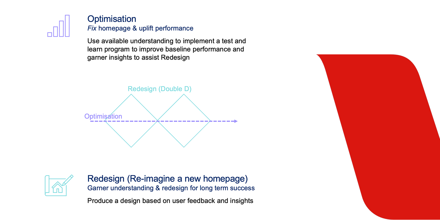
To tackle the opportunities, we made the decision to take a 2-speed approach:
This would allow us to tackle known, quick-win opportunities
While also providing us with the space to refine some ideas that required more thinking before we could take action
While also providing us with the space to refine some ideas that required more thinking before we could take action
In the optimisation stream:
- Focus: Use available understanding to progressively improve the experience and build our knowledge
- Method: We took a test&learn approach, using lean design techniques to validate hypothesis over your traditional 2 week sprint cadence
- Also establish a way to measure homepage performance which would be the benchmark from which to measure future activities
In parallel, we also kicked off our re-design work
- Focus: Was understand the needs of customers AND re-imagine what a future-state homepage experience could be
- Method: Which followed the double diamond approach which allowed us to understand the problem space more holistically take ideas from an ambiguous state to discrete opportunities that we could take action on
Roles and responsibilities:
The team:
Service owner - Tim Cheng
Digital brand lead - Michael Pineda
Senior CX designer - Paul Rodens
Senior UI designer - Cris Frulla
CX designer - Shasha Chaicharncheep
UI designer - Claudia Carroll
Digi producer - Will Kerr
Digi producer - Nick Graham
Digi optimisation - Sera Buay
Lead researcher - Annie Bruxner & Grace Chambers
My Role:
I led the entire effort from a discovery and design perspective, liaising with the research team to brief, organise and attend all customer facing activities, relaying the outcome of each phase to key stakeholders, negotiate budgets, work with the visual designer to create new version of the home page based in insights.


2. What happened
the Design Process
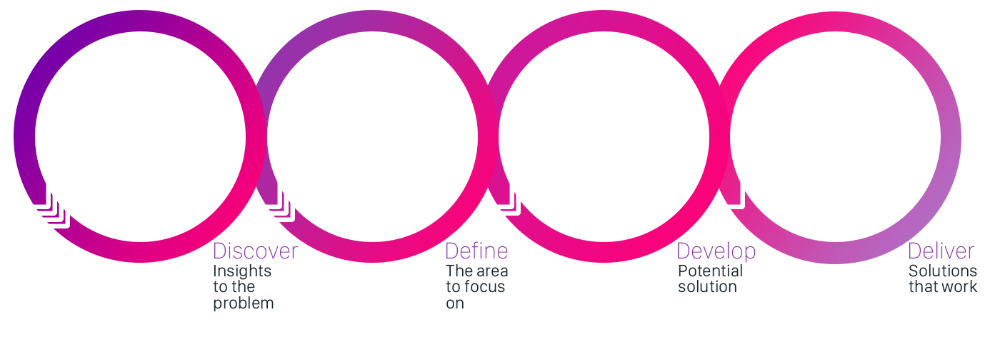

2.1 Discover Insights to the problem
The first thing we did was a project ‘kick off’ with the BA, PM and key stakeholders in order to gather insights into the problem, have an understanding of the scope and identify any potentially risky assumptions.
I did several internal listening tours with MYOB accountants and members of the desktop team in order to gather knowledge of the subject and existing implementations.
What did we know?
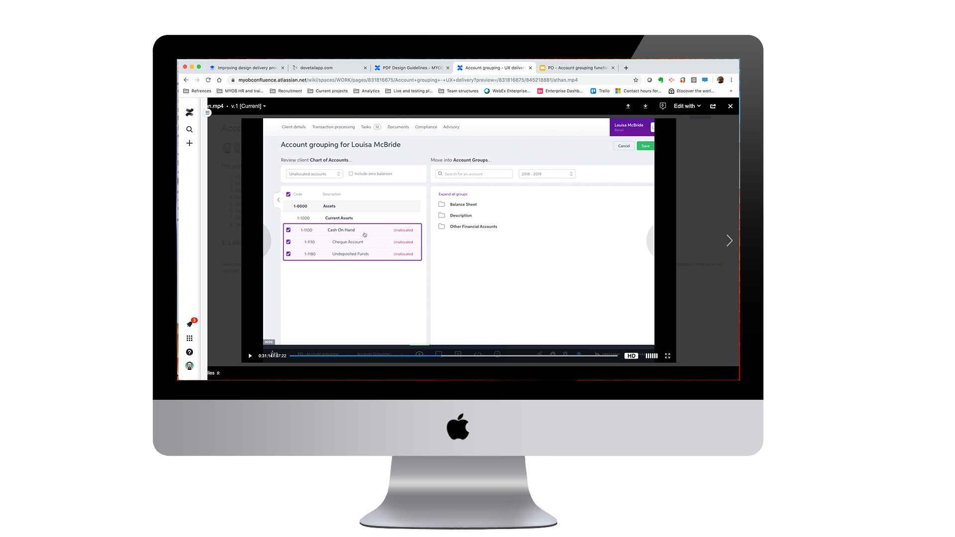
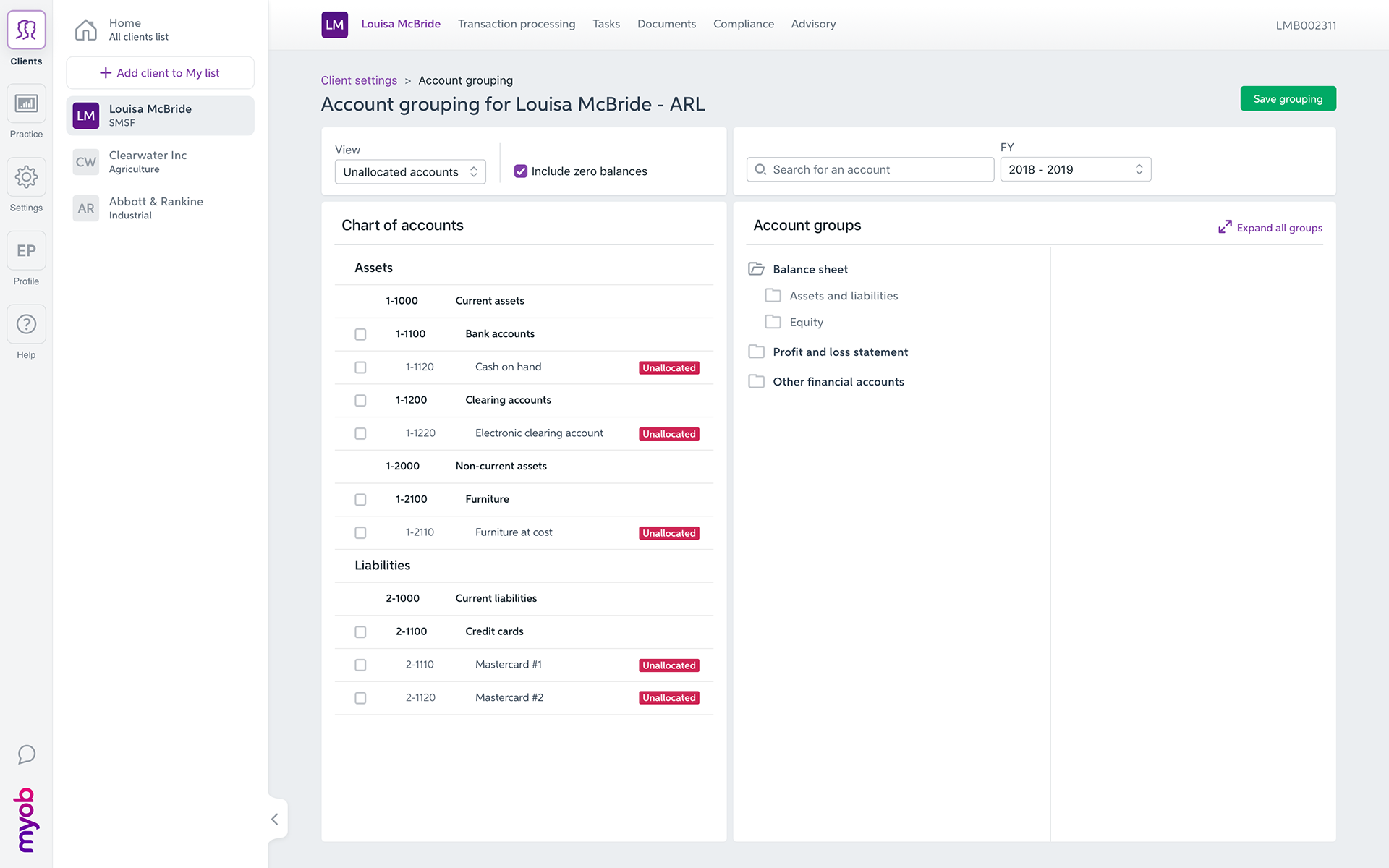
• Users need to map or group client accounts in order for the data to flow through the relevant parts of the solution.
• The current desktop implementation has duplicated the account grouping functionality for different outputs (or purposes); Tax, accounting and advisory.
• Practice level settings can be applied for similar clients using the same type of ledgers.
• The current desktop implementation has duplicated the account grouping functionality for different outputs (or purposes); Tax, accounting and advisory.
• Practice level settings can be applied for similar clients using the same type of ledgers.
Our hypothesis
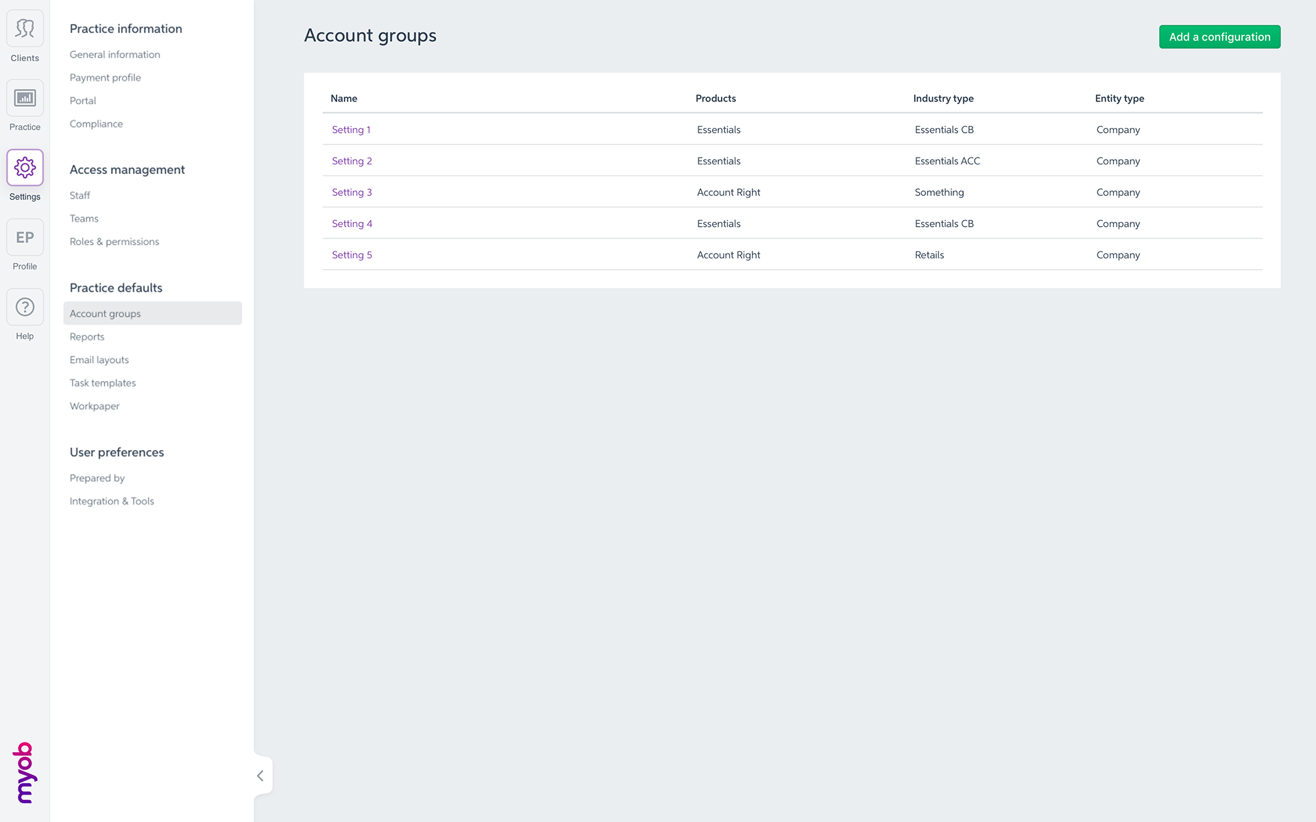
• Adding an account grouping section in the practice settings part of MYOB practice to allow users to manage and group accounts at a practice but also client level.
• Accountants would prefer to have a centralised account grouping function that would cater for Tax, Accounting and Advisory and not having to repeat the process from different places.
• Accountants would want to be able to manage practice but also client level settings.
• Keeping an similar interface to the one of the desktop environment (but remove the clutter) to give the users a sense of familiarity and avoid having to relearn how to group accounts.

2.2 Define - the are to focus on
What we didn’t know and wanted to discover
• How users are expecting to identify unallocated accounts
• What is their current experience using the desktop product, what do they like, what could / should be improved
• What interactions are users expecting in order to group or map an account to a group; buttons, drag and drop, right click, others ...
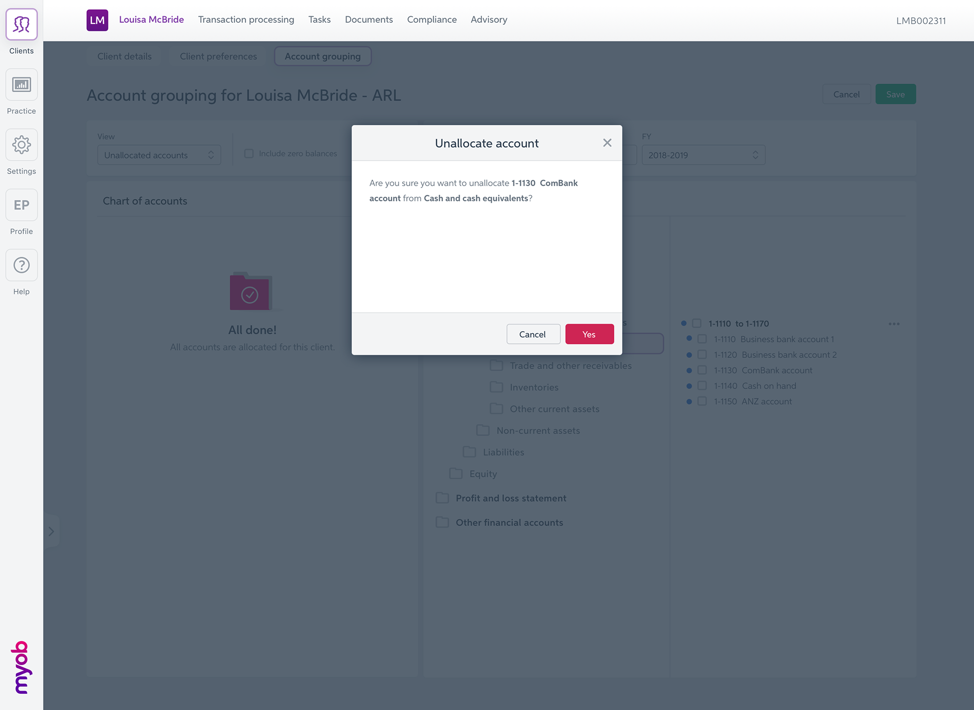
• Can user map an account twice, what are the scenarios?
• Are users expect to roll over the settings from the desktop account mapping?
• Are users expecting to be able to "restore" to certain level (practice setting)?
• Are users using the practice defaults or are they doing account grouping on a client by client basis?
• What is their expectations managing credit & debit ranges?
• What is their expectation in therm of saving, manual or autosave?
• What is their expectation "moving" accounts or groups of account from one folder to another?
• What interactions are users expecting in order to group or map an account to a group; buttons, drag and drop, right click, others ...
• Can user map an account twice, what are the scenarios?
• Are users expect to roll over the settings from the desktop account mapping?
• Are users expecting to be able to "restore" to certain level (practice setting)?
• Are users using the practice defaults or are they doing account grouping on a client by client basis?
• What is their expectations managing credit & debit ranges?
• What is their expectation in therm of saving, manual or autosave?
• What is their expectation "moving" accounts or groups of account from one folder to another?

2.3 Develop - potential solution
What was tested?
• How would a user find or isolate unallocated accounts?
• How would a user would allocate (or map) and account to a specific group?
• How would a user update an account range?
• How would a user manage credit and debit ranges?
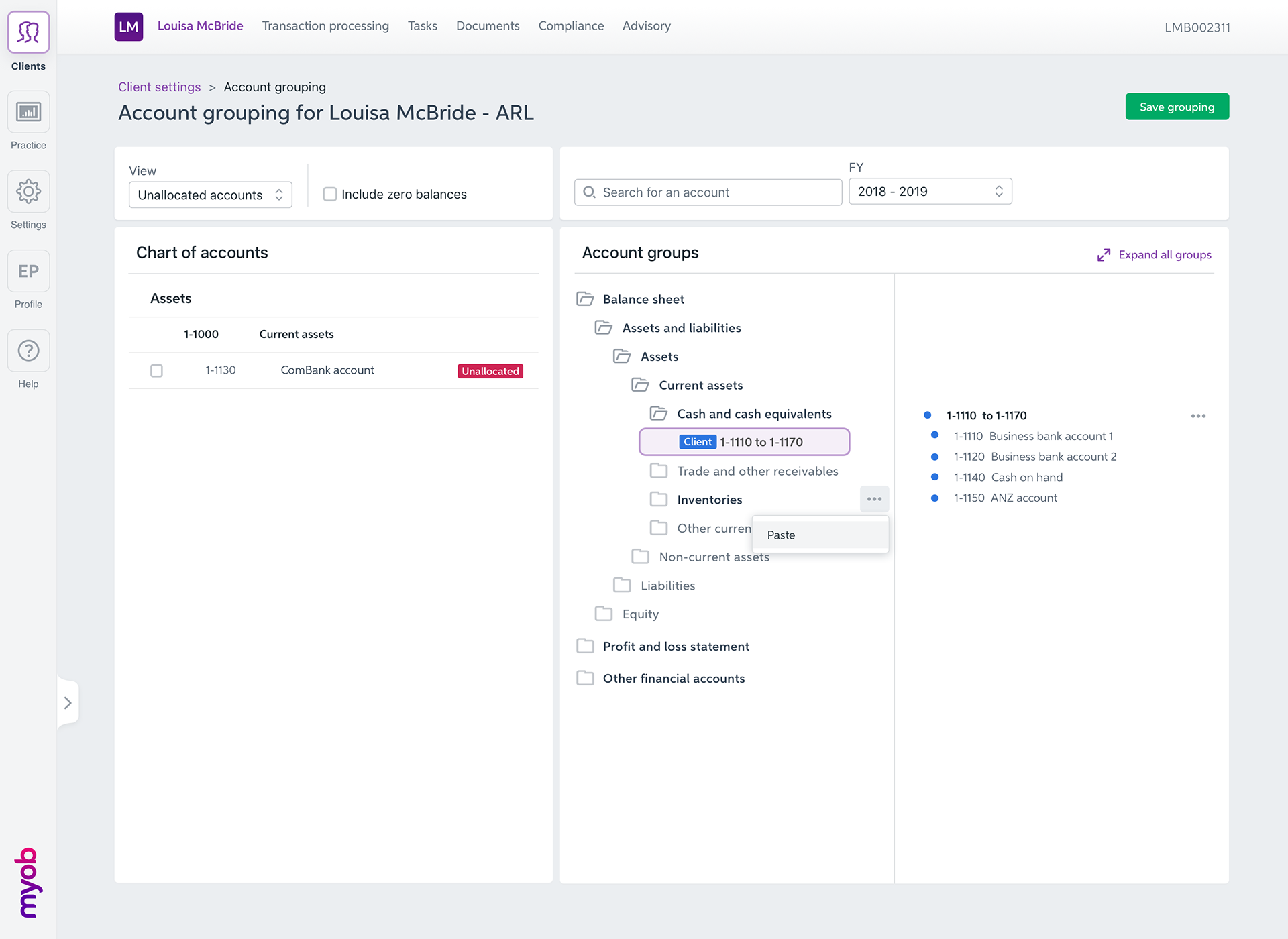
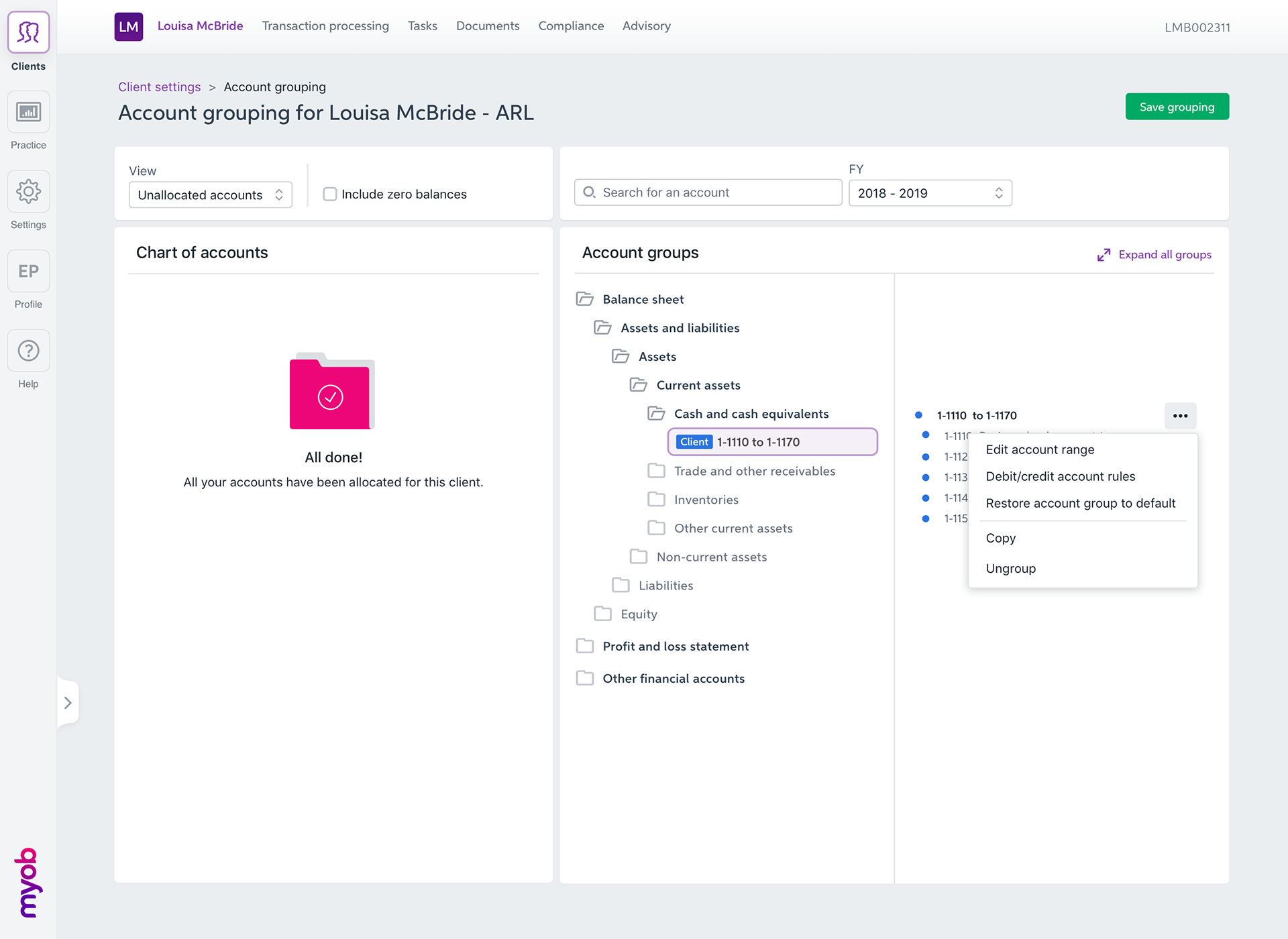
• How would a user delete but also copy and paste a set of accounts?
• How would a user use the search functionality?
• How would a user update an account range?
• How would a user manage credit and debit ranges?
• How would a user delete but also copy and paste a set of accounts?
• How would a user use the search functionality?
Usability testing
• Semi interactive prototypes (done in Sketch and Invision) that allowed testers to perform specific tasks
• High fidelity prototypes (we don’t really do many low fidelity prototypes at MYOB once we go to user testing)
• Interview guide
• Interview guide
What was the result? Highlights?
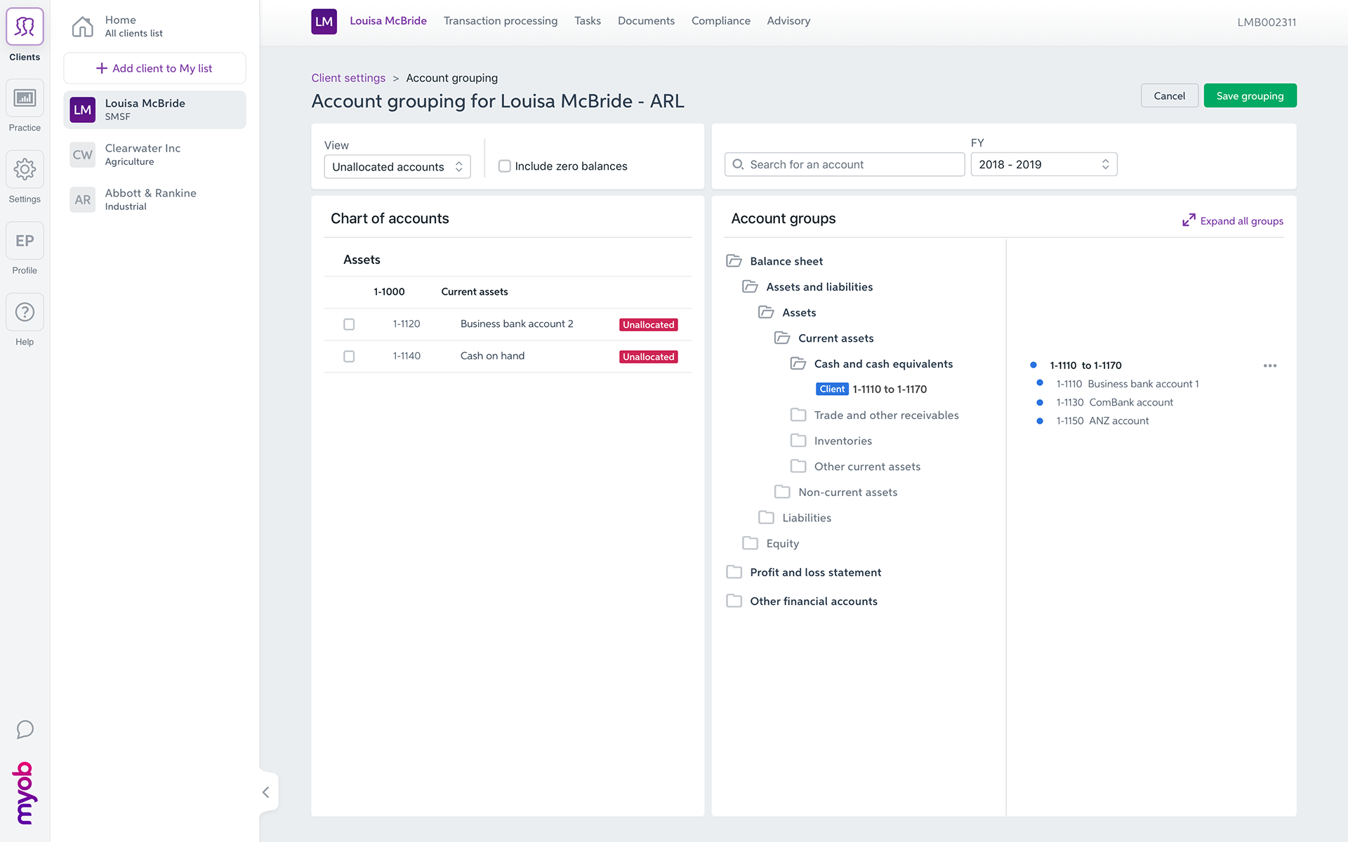
• All testers successfully retrieved the account grouping functionality in the practice settings
• Because the page hierarchy is inspired by the desktop product, all testers could identify quickly the available features with a certain degree of confidence
• All testers enjoyed the fact that the interfaced was cleaner and easier to use, as we removed a lot of clutter and unnecessary features
• All testers enjoyed the drag and drop function and found it intuitive and appropriate to this function
• Not all testers realised we now are suggesting to consolidate accounting, tax and advisory in one consolidate section
• Not all testers discovered the account grouping at a client level
• All testers are expecting feature to be manually saved, as there could be some trial error involved and they don't want wrong data starting to flow through unwillingly
• All testers responded very well to the "familiar" interface and how it doesn't look to dissimilar to the desktop interface. it helped users to achieve most testing tasks relatively easily and avoided them having to learn a brand new interface

2.4 Deliver -Solutions that work
What did I deliver?
What did I deliver?
The findings of the round of user testing was presented to the key stakeholders in a meeting.
Based on these insights, we agreed on the first version, or MVP of account grouping and what needed
to be released for the users to be able to achieve their primary goals.
This was a combined effort with the development team, BA and PM.
Based on these insights, we agreed on the first version, or MVP of account grouping and what needed
to be released for the users to be able to achieve their primary goals.
This was a combined effort with the development team, BA and PM.
I iterated on the designs and delivered a set of interactive prototypes that covered all the use cases we agreed to deliver
for the first cut of this feature.
for the first cut of this feature.
I worked closely with Customer Experience to create and review the copy across the entire delivery.
Some trade offs were made and we had to make some compromises that went against the users’ feedback that we uncovered during the user testings.
What were they?
• Despite users loving the drag and drop feature, this interaction has been de-scoped.
The development estimate in order to achieve this interaction would have cost MYOB an extra sprint of development.
Because this feature is not a frequently used feature, it was the PM's decision not to come back to this and add the interaction at a later date.
The development estimate in order to achieve this interaction would have cost MYOB an extra sprint of development.
Because this feature is not a frequently used feature, it was the PM's decision not to come back to this and add the interaction at a later date.


3. In conclusion
Outcomes and results:
• Overall this was a very successful project.
It was a relatively challenging project as the subject was (and still is) very hard to grasp if you are not an accountant.
It took me a long time before I could get onto the designs themselves, trying to understand the primary objectives of the users when using this feature.
It was a relatively challenging project as the subject was (and still is) very hard to grasp if you are not an accountant.
It took me a long time before I could get onto the designs themselves, trying to understand the primary objectives of the users when using this feature.
• It was the first time I worked with Amira, as BA and as she had just started at MYOB, she was equally trying to find her feed in a new team and in a new organisation. We both at to work at understand each other and how our skill could complement in order to achieve this project successfully
• The amount of features we had to tackle, discover and design for as part of this project where rather substantial and to some respect, it nearly was a waterfall project.
The next time I would hit such a big project with so many deliverables, I would work with my PM and try to break down the scopes into smaller deliverables, easier to manage, test and deliver.
The next time I would hit such a big project with so many deliverables, I would work with my PM and try to break down the scopes into smaller deliverables, easier to manage, test and deliver.
• Based on more recent experience, I would involve the team a lot more in the research / usability testing process.